Saturday, 22 May 2010
Monday, 17 May 2010
Title, light tests
This first clip is much too fast, the lighting is really rough and choppy..
I then wanted the 'HOW TO TAME A DRAGON' to be on screen longer as this is the introduction to the animation.
Here i have sorted out the lighting and i have begun to add a fractal noise effect so that when the text appears it will shimmer and dull so it is not missed, and then will fade like the title.
I have asked a few friends about how the timing reads on the last sequence and they all thought it worked well. Obviously this is unfinished but its just the timing needed for now.
Schedule Update
Ok so this is the FINAL week as deadline is on Friday 21st May 5pm.
Andi has now left for Cuba and I have lots to be getting on with as we are behind schedule.
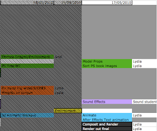
Ok so list of order for things to work -
I need to have the timing correct in the animation to send for the sound student to work on, which means the dragon animation needs to be finished completely.
For the text animation i just need the timing to be right when things pop up and make sure everything is on there like a sparkle when the diamonds come on.
I can then hand this to the sound student to work on whilst i meanwhile work on the title sequence in the looks, and not altering the timing.
1. Complete dragon animation.
2. Text animation completed.
3. Sound student!
I now also have to model the props for the scene and draw the prop illustrations i wanted for the title sequence.
I am not happy with the look of the title sequence but this is low in my priorities right now though its on my mind. I need to give it that old look i was talking about with using PS to get the textures and colours i want.
4. Illustrations of props and first shot of scene.
5. Photoshop work on title sequence book.
So far that's what i will be concentrating on for the next day or two. I have already animated out two of the shots so i have two left to do then i can send them to the sound student.
I'll post up the two renders for the shot sequence on here once i have rendered them out
Sunday, 16 May 2010
TExt
I am trying to figure out how to achieve the look which i want for the text, i want it to FEEL as though we are looking into an old tethered and magical book, discovering secrets about these dragons!
I want the look of a candle flame flickering and lighting up the scene as we read the text.
Here is a quick render test in after effects using expressions on the light layer and it only effects the dragonoloy logo, not the text. I'm having trouble in not understanding why the light wont show up the text in the composition. Anyway this fluctuation of the light gives me the impression of a fast flickering flame which isn't the soft feel i wanted for the dragon.
(quick thought here, what if i were to darken out the scene when hearing the dragon roar to take us into the 3d environment)
Here is another render out of the same footage but i have slowed the fluctuation down which looks better in my opinion. I want a slower flicker because i imagine this book to be read in a quiet secret place, not outside in the blazing wind THIS BOOK IT FRAGILE!
I am thinking of kerning the text for the title to make it look more aged and withered, also on the dragonology logo. Though first i need to have my timing sorted so i can hand it to the sound student then i can continue working on it.
Friday, 14 May 2010
Research for title animation
This is just a quick test render of the dragon finding the gem.
http://www.youtube.com/watch?v=WRUgNRfgjn4&feature=related
This link has the idea for adding a mask with feather, and pretty much animating up and down the page to find the text. It's more creative than just changing the opacity.
I was also thinking what if i were to unmask the text so it looks mystical. Influenced by harry potter title sequence.
For the paper background which i have at the moment, i feel that the text, motif border and paper don't all fit together, it's looking too digital.

So here are some paper ideas which will inspire the new look

I like the darkness on either side of the image

I am liking the grain

I like the grain here but i feel the contrast is too high.

How about using the idea of it being in the page spread of the spine.

And finally the little motifs in the corners, i like the idea of using the dragonology logo in the background.
Wednesday, 12 May 2010
Text Test 2
By adding a Tritone effect i can control the mid tones highlights and shadows, so it has given me the golden look i wanted. Now to play with a glow or light.
Text Test
I applied fractal noise to the images in After Effects for a quick test render to how this would look. I would like to be able to control the colour to a gold which i'll play with later. Alsofor a way to keep the text on the page after in the beige i will use a separate layer of the same text underneath. Maybe i could add a Glow or use the Light Ray effect to make it go out with a shine.
I like how this is looking though maybe make one sweep with the shimmer.
Tuesday, 11 May 2010
Title and animation work to be done.
Hi Lydia,
Extract from the book -
In the book i liked this border used with Dr Drakes handwriting.
So here i have used the border from the book and used curves to create the stronger colour.
I have used the AT Pelican font for the text. I will create a quick render test once i can get hold of my graphics tablet to show what i mean for the animated title sequence.
I don't like the idea of just animating the opacity in and out.. so i have found a nice tutorial effect called 'Ancient_title' thrhough video co pilot. Maybe i could take the glowing particles as dragons dust which happens when the text is fading to the illustration, then to the 3d scene.
The way in which the animation has been storyboarded allows for the animtion to be taken from the different shots. If the animation was permanently on screen it wouldn't be so easy to get the dragon into position for the next shot. There are four different camera shots, so the animation will be split accordingly.
I got Andi to change the landscape size to fit dragon also for him to flatten the land to animate on.
Nghiem wants a silent film style, I am going to play around with creating this effect in the compositing stage. On the website they just have the Dragonology logo fade in and out then the title of the clip also fading in and out, then fades into the live action footage. The text and setup is probably the silent film style unlike the actual footage.
I need to sort out how long this animation is actually going to be. There is plenty to be getting on with and hopefully enough time!
-----
So basically i need to draft out how i want the titles to be done, and have a play with this in After Effects, I need to block out the animatic in 3d for the shots by Friday so that i can hand this to one of the sound students. Then i need to be creating the smooth animation. and to render composit and render out the final to broadcast standards.
Meanwhile for the showreel i need to re render out compressed background menu.
Do what you think best for your film. It's very kind of to consider theWhilst Andi is sorting out the stage for the animation i have been thinking about the title sequence for the animation. I have been thinking how i could create a similar looking text to the book but thought i should be smart and ask Nghiem for the font AT-Pelican and Beffle.
feedback from me!
Please find attached a couple of mac compatible fonts to help you with your project only.
AT Pelican is the font used for the Dragonology logotype. Beffle is the font used for the drop caps. It makes a good display font for silent films.
Good luck. I'm going to try and get to RAVE Live. Hope to see you there.
Take care,
Nghiem
------------------------
Hello,
Thank you that works fine now, is there any for you'd prefer to have as
the main text, as i noticed in the book you have some really nice italic
fonts like the one on this link to an image..
http://www.dragonology.com/main_menu.html
Thank you,
Lydia
------------------
Hi Lydia,
The font choice is yours. Just make sure it is readable/clear and looks good
on screen you'll be fine!
The italic font you were referring to is ATPelican, the font I sent through.
Sometimes it will need additional kerning in places.
Looking forward to seeing you at RAVE Live, hope it is all going well.
Take care,
Nghiem
---------
"AT Pelican is the font used for the Dragonology logotype. Beffle is the font used for the drop caps. It makes a good display font for silent films."Here on the cover of the Dragonology we have the red background with a shiny slightly darker red for the dragon, I'm thinking to take this from the book and use it for the title sequence text.


From the Dragonology DS trailer which i have pointed out previously, we can see the animation is set in the book, where the animation is always on screen. Also around the page to the left we can see some illustrations of footprints.. I am thinking to use this idea of having an inactive illustration behind the title sequence text, which is the first camera shot for the 3d animation. So once the first shot is down I will create a line drawing of the scene which will be behind the text. The text will fade, so we are left with the line drawing, and then the line drawing will dissolve into the 3d animated scene.

Extract from the book -

In the book i liked this border used with Dr Drakes handwriting.

So here i have used the border from the book and used curves to create the stronger colour.
I have used the AT Pelican font for the text. I will create a quick render test once i can get hold of my graphics tablet to show what i mean for the animated title sequence.
I don't like the idea of just animating the opacity in and out.. so i have found a nice tutorial effect called 'Ancient_title' thrhough video co pilot. Maybe i could take the glowing particles as dragons dust which happens when the text is fading to the illustration, then to the 3d scene.
The way in which the animation has been storyboarded allows for the animtion to be taken from the different shots. If the animation was permanently on screen it wouldn't be so easy to get the dragon into position for the next shot. There are four different camera shots, so the animation will be split accordingly.
I got Andi to change the landscape size to fit dragon also for him to flatten the land to animate on.
Nghiem wants a silent film style, I am going to play around with creating this effect in the compositing stage. On the website they just have the Dragonology logo fade in and out then the title of the clip also fading in and out, then fades into the live action footage. The text and setup is probably the silent film style unlike the actual footage.
I need to sort out how long this animation is actually going to be. There is plenty to be getting on with and hopefully enough time!
-----
So basically i need to draft out how i want the titles to be done, and have a play with this in After Effects, I need to block out the animatic in 3d for the shots by Friday so that i can hand this to one of the sound students. Then i need to be creating the smooth animation. and to render composit and render out the final to broadcast standards.
Meanwhile for the showreel i need to re render out compressed background menu.
Monday, 10 May 2010
Showreel
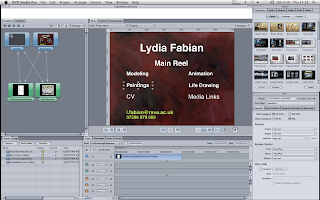
Ok so after some playing around i just thought it best to get the content roughly sorted and have everything together so it can be edited and ready to go when i want to neaten it up.
Here was a quick ident a ran together. For my name i just selected separate fonts for each letter and laid them out. I chose the purple background as that is my favorite colour and i chose the yellow/mustard coloured font as they are opposites on the colour wheel.
I thought to try a few layouts and these are the top two, i think i'm more into the first one because the layout is clearer and what the focus is drawn to my name then the main reel, and then the separate menus.
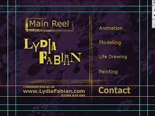
This is the menu i will be using for my dvd menu.
previously i had used this layout which was just a mess, the background was on a slow dust and scratches preset. I think my revised menu is better planned out.
Here was a quick ident a ran together. For my name i just selected separate fonts for each letter and laid them out. I chose the purple background as that is my favorite colour and i chose the yellow/mustard coloured font as they are opposites on the colour wheel.


I thought to try a few layouts and these are the top two, i think i'm more into the first one because the layout is clearer and what the focus is drawn to my name then the main reel, and then the separate menus.
This is the menu i will be using for my dvd menu.
previously i had used this layout which was just a mess, the background was on a slow dust and scratches preset. I think my revised menu is better planned out.

Thursday, 6 May 2010
Schedule Update

So with three weeks left there is plenty to be getting on with!
Andi is going to be modeling/texturing props, the environment and dragon, also creating the Photoshopped backgrounds.
Meanwhile I am creating a 3d animatic then moving onto the animation. Working on the the text animation like a dust effect using the font which Nghiem has sent.
Once I have a block out animatic I can send this onto one of the sound students.
Andi will also be lighting the scene.
Andi is on holiday for the last week of the deadline so I will be rendering and compositing.
Monday, 3 May 2010
Showreel research
I have been looking out for good showreels within motion graphics, character animation and animation/modeling. I can't embed showreels onto this blog as they have that disabled through youtube.
Animation mentor showcase - in their student showcase i liked how there was a variety between added music over some of the animations, and when the animation had its own audio the music would either turn off or dull down to make it obvious. They also titled each section and there was a variety of work between style and themes.
Company showreels.
Lumiere's showreel began with their company logo ident. They used music to help with the pacing and i think that it works well because they have the video clips edited in time with the music. Although personally I'm not too hot on the track used. For my showreel i need to sit and think what will work best with all my clips once i have them together.
Studio AKA - showreel, they have just linked us to a site where you can click through each animation they have done. I like that you can view all their work but it should be in a showreel labeled so that the viewer is enticed to go see more.
Trunk - They do both 3d and 2d and in their showreel they have them in separate sections titled apart. In their showreel they have cut up the longer animations and placed different parts throughout the showreel. They have used instrumental music as opposed to chart music.
It seems from these companies that the music reflects the style of their work.
Music
I feel that music is a tough call on what to place with the showreel as everyone has different tastes. It can be distracting to the content being shown or it can really drive it. I haven't thought too much about the music in my showreel, i think it should be something that isn't distracting from the work, something which isn't loud, or droning on in the background. Instrumental would work best perhaps?
What makes a successful animation showreel?
"Try and show relevant material but not a copy of their house style - originality is rewarded, so is a range of work."
"The best ones are simple"
Sourced tips from this website,
http://www.fxguide.com/modules.php?name=fxtips&rop=showcontent&id=269
What a showreel means to me is a collection and showcase of your best work. Presented in your style. Everything about it shouting out what you can do and your STYLE. So that when your dvd is put on a company shelf, they should be able to think 'oh yes' and know what you are good for. You shouldn't try and be a jack of all trades because people need to know your niche and they will come to you for what you're good at.
What am I wanting to show?
Model, Texture, Light, Rig, Animate, Life Drawing, Painting/chalks/drawing, Photography, links to online presence, CV (available to download as PDF)
Who is it for?
This is a great question because i wouldn't want to apply for an animation role and only show the employer modeling, i need to make sure i fill my reel with my best of what i can do for them. Originality will go far and quality over quantity
My DVD layout of menu will need to be easy to work. So i don't want a busy overcomplicated layout with thousands of buttons. I want it to work in both pc and dvd players, i want to to have my name and contact details plastered all over and it needs to follow a layout scheme. Colours will be what i have used for my name previously being black, pink, white and blue.
Subscribe to:
Posts (Atom)