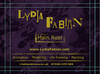
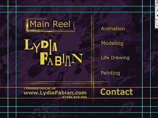
Here was a quick ident a ran together. For my name i just selected separate fonts for each letter and laid them out. I chose the purple background as that is my favorite colour and i chose the yellow/mustard coloured font as they are opposites on the colour wheel.


I thought to try a few layouts and these are the top two, i think i'm more into the first one because the layout is clearer and what the focus is drawn to my name then the main reel, and then the separate menus.
This is the menu i will be using for my dvd menu.
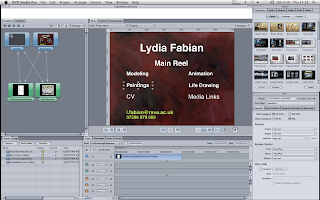
previously i had used this layout which was just a mess, the background was on a slow dust and scratches preset. I think my revised menu is better planned out.

No comments:
Post a Comment