This is just a quick test render of the dragon finding the gem.
http://www.youtube.com/watch?v=WRUgNRfgjn4&feature=related
This link has the idea for adding a mask with feather, and pretty much animating up and down the page to find the text. It's more creative than just changing the opacity.
I was also thinking what if i were to unmask the text so it looks mystical. Influenced by harry potter title sequence.
For the paper background which i have at the moment, i feel that the text, motif border and paper don't all fit together, it's looking too digital.
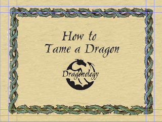
So here are some paper ideas which will inspire the new look
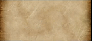
I like the darkness on either side of the image
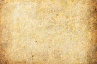
I am liking the grain

I like the grain here but i feel the contrast is too high.
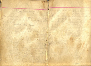
How about using the idea of it being in the page spread of the spine.

And finally the little motifs in the corners, i like the idea of using the dragonology logo in the background.
No comments:
Post a Comment