Friday, 4 June 2010
Evaluation
So this is my final render for hand in. Unfortunately its not completed but i will continue working on this brief for the Nghiem within the next few weeks so that i can have more animation and props.
There is no sound added to the final for hand in because I had no replies from the sound student, hopefully he will still want to work on the sound for the clients finished version.
I feel that i had learnt so much and at the beginning of term i was full steam 100% committed to producing the best work i can. Though i feel i had been lacking in the last two weeks, i was not working to my best because of a few reasons - moving house twice, i was ill for a week, and personal reasons too.
I will continue working on this animation so it is fit for Nghiems needs. I will need to add more animation with the dragon, add textures to behind the text, and add sound. Also get Andi to finihs modeling props, then i can add effects in after effects in the compositing stage.
Saturday, 22 May 2010
Monday, 17 May 2010
Title, light tests
This first clip is much too fast, the lighting is really rough and choppy..
I then wanted the 'HOW TO TAME A DRAGON' to be on screen longer as this is the introduction to the animation.
Here i have sorted out the lighting and i have begun to add a fractal noise effect so that when the text appears it will shimmer and dull so it is not missed, and then will fade like the title.
I have asked a few friends about how the timing reads on the last sequence and they all thought it worked well. Obviously this is unfinished but its just the timing needed for now.
Schedule Update
Ok so this is the FINAL week as deadline is on Friday 21st May 5pm.
Andi has now left for Cuba and I have lots to be getting on with as we are behind schedule.
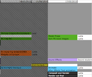
Ok so list of order for things to work -
I need to have the timing correct in the animation to send for the sound student to work on, which means the dragon animation needs to be finished completely.
For the text animation i just need the timing to be right when things pop up and make sure everything is on there like a sparkle when the diamonds come on.
I can then hand this to the sound student to work on whilst i meanwhile work on the title sequence in the looks, and not altering the timing.
1. Complete dragon animation.
2. Text animation completed.
3. Sound student!
I now also have to model the props for the scene and draw the prop illustrations i wanted for the title sequence.
I am not happy with the look of the title sequence but this is low in my priorities right now though its on my mind. I need to give it that old look i was talking about with using PS to get the textures and colours i want.
4. Illustrations of props and first shot of scene.
5. Photoshop work on title sequence book.
So far that's what i will be concentrating on for the next day or two. I have already animated out two of the shots so i have two left to do then i can send them to the sound student.
I'll post up the two renders for the shot sequence on here once i have rendered them out
Andi has now left for Cuba and I have lots to be getting on with as we are behind schedule.

Ok so list of order for things to work -
I need to have the timing correct in the animation to send for the sound student to work on, which means the dragon animation needs to be finished completely.
For the text animation i just need the timing to be right when things pop up and make sure everything is on there like a sparkle when the diamonds come on.
I can then hand this to the sound student to work on whilst i meanwhile work on the title sequence in the looks, and not altering the timing.
1. Complete dragon animation.
2. Text animation completed.
3. Sound student!
I now also have to model the props for the scene and draw the prop illustrations i wanted for the title sequence.
I am not happy with the look of the title sequence but this is low in my priorities right now though its on my mind. I need to give it that old look i was talking about with using PS to get the textures and colours i want.
4. Illustrations of props and first shot of scene.
5. Photoshop work on title sequence book.
So far that's what i will be concentrating on for the next day or two. I have already animated out two of the shots so i have two left to do then i can send them to the sound student.
I'll post up the two renders for the shot sequence on here once i have rendered them out
Sunday, 16 May 2010
TExt
I am trying to figure out how to achieve the look which i want for the text, i want it to FEEL as though we are looking into an old tethered and magical book, discovering secrets about these dragons!
I want the look of a candle flame flickering and lighting up the scene as we read the text.
Here is a quick render test in after effects using expressions on the light layer and it only effects the dragonoloy logo, not the text. I'm having trouble in not understanding why the light wont show up the text in the composition. Anyway this fluctuation of the light gives me the impression of a fast flickering flame which isn't the soft feel i wanted for the dragon.
(quick thought here, what if i were to darken out the scene when hearing the dragon roar to take us into the 3d environment)
Here is another render out of the same footage but i have slowed the fluctuation down which looks better in my opinion. I want a slower flicker because i imagine this book to be read in a quiet secret place, not outside in the blazing wind THIS BOOK IT FRAGILE!
I am thinking of kerning the text for the title to make it look more aged and withered, also on the dragonology logo. Though first i need to have my timing sorted so i can hand it to the sound student then i can continue working on it.
Friday, 14 May 2010
Research for title animation
This is just a quick test render of the dragon finding the gem.
http://www.youtube.com/watch?v=WRUgNRfgjn4&feature=related
This link has the idea for adding a mask with feather, and pretty much animating up and down the page to find the text. It's more creative than just changing the opacity.
I was also thinking what if i were to unmask the text so it looks mystical. Influenced by harry potter title sequence.
For the paper background which i have at the moment, i feel that the text, motif border and paper don't all fit together, it's looking too digital.
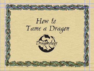
So here are some paper ideas which will inspire the new look
I like the darkness on either side of the image

I am liking the grain

I like the grain here but i feel the contrast is too high.
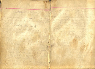
How about using the idea of it being in the page spread of the spine.

And finally the little motifs in the corners, i like the idea of using the dragonology logo in the background.
Wednesday, 12 May 2010
Text Test 2
By adding a Tritone effect i can control the mid tones highlights and shadows, so it has given me the golden look i wanted. Now to play with a glow or light.
Text Test
I applied fractal noise to the images in After Effects for a quick test render to how this would look. I would like to be able to control the colour to a gold which i'll play with later. Alsofor a way to keep the text on the page after in the beige i will use a separate layer of the same text underneath. Maybe i could add a Glow or use the Light Ray effect to make it go out with a shine.
I like how this is looking though maybe make one sweep with the shimmer.
Tuesday, 11 May 2010
Title and animation work to be done.
Hi Lydia,
Extract from the book -
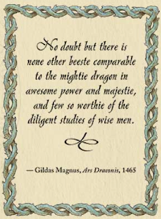
In the book i liked this border used with Dr Drakes handwriting.
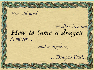
So here i have used the border from the book and used curves to create the stronger colour.
I have used the AT Pelican font for the text. I will create a quick render test once i can get hold of my graphics tablet to show what i mean for the animated title sequence.
I don't like the idea of just animating the opacity in and out.. so i have found a nice tutorial effect called 'Ancient_title' thrhough video co pilot. Maybe i could take the glowing particles as dragons dust which happens when the text is fading to the illustration, then to the 3d scene.
The way in which the animation has been storyboarded allows for the animtion to be taken from the different shots. If the animation was permanently on screen it wouldn't be so easy to get the dragon into position for the next shot. There are four different camera shots, so the animation will be split accordingly.
I got Andi to change the landscape size to fit dragon also for him to flatten the land to animate on.
Nghiem wants a silent film style, I am going to play around with creating this effect in the compositing stage. On the website they just have the Dragonology logo fade in and out then the title of the clip also fading in and out, then fades into the live action footage. The text and setup is probably the silent film style unlike the actual footage.
I need to sort out how long this animation is actually going to be. There is plenty to be getting on with and hopefully enough time!
-----
So basically i need to draft out how i want the titles to be done, and have a play with this in After Effects, I need to block out the animatic in 3d for the shots by Friday so that i can hand this to one of the sound students. Then i need to be creating the smooth animation. and to render composit and render out the final to broadcast standards.
Meanwhile for the showreel i need to re render out compressed background menu.
Do what you think best for your film. It's very kind of to consider theWhilst Andi is sorting out the stage for the animation i have been thinking about the title sequence for the animation. I have been thinking how i could create a similar looking text to the book but thought i should be smart and ask Nghiem for the font AT-Pelican and Beffle.
feedback from me!
Please find attached a couple of mac compatible fonts to help you with your project only.
AT Pelican is the font used for the Dragonology logotype. Beffle is the font used for the drop caps. It makes a good display font for silent films.
Good luck. I'm going to try and get to RAVE Live. Hope to see you there.
Take care,
Nghiem
------------------------
Hello,
Thank you that works fine now, is there any for you'd prefer to have as
the main text, as i noticed in the book you have some really nice italic
fonts like the one on this link to an image..
http://www.dragonology.com/main_menu.html
Thank you,
Lydia
------------------
Hi Lydia,
The font choice is yours. Just make sure it is readable/clear and looks good
on screen you'll be fine!
The italic font you were referring to is ATPelican, the font I sent through.
Sometimes it will need additional kerning in places.
Looking forward to seeing you at RAVE Live, hope it is all going well.
Take care,
Nghiem
---------
"AT Pelican is the font used for the Dragonology logotype. Beffle is the font used for the drop caps. It makes a good display font for silent films."Here on the cover of the Dragonology we have the red background with a shiny slightly darker red for the dragon, I'm thinking to take this from the book and use it for the title sequence text.
From the Dragonology DS trailer which i have pointed out previously, we can see the animation is set in the book, where the animation is always on screen. Also around the page to the left we can see some illustrations of footprints.. I am thinking to use this idea of having an inactive illustration behind the title sequence text, which is the first camera shot for the 3d animation. So once the first shot is down I will create a line drawing of the scene which will be behind the text. The text will fade, so we are left with the line drawing, and then the line drawing will dissolve into the 3d animated scene.
Extract from the book -

In the book i liked this border used with Dr Drakes handwriting.

So here i have used the border from the book and used curves to create the stronger colour.
I have used the AT Pelican font for the text. I will create a quick render test once i can get hold of my graphics tablet to show what i mean for the animated title sequence.
I don't like the idea of just animating the opacity in and out.. so i have found a nice tutorial effect called 'Ancient_title' thrhough video co pilot. Maybe i could take the glowing particles as dragons dust which happens when the text is fading to the illustration, then to the 3d scene.
The way in which the animation has been storyboarded allows for the animtion to be taken from the different shots. If the animation was permanently on screen it wouldn't be so easy to get the dragon into position for the next shot. There are four different camera shots, so the animation will be split accordingly.
I got Andi to change the landscape size to fit dragon also for him to flatten the land to animate on.
Nghiem wants a silent film style, I am going to play around with creating this effect in the compositing stage. On the website they just have the Dragonology logo fade in and out then the title of the clip also fading in and out, then fades into the live action footage. The text and setup is probably the silent film style unlike the actual footage.
I need to sort out how long this animation is actually going to be. There is plenty to be getting on with and hopefully enough time!
-----
So basically i need to draft out how i want the titles to be done, and have a play with this in After Effects, I need to block out the animatic in 3d for the shots by Friday so that i can hand this to one of the sound students. Then i need to be creating the smooth animation. and to render composit and render out the final to broadcast standards.
Meanwhile for the showreel i need to re render out compressed background menu.
Monday, 10 May 2010
Showreel
Ok so after some playing around i just thought it best to get the content roughly sorted and have everything together so it can be edited and ready to go when i want to neaten it up.
Here was a quick ident a ran together. For my name i just selected separate fonts for each letter and laid them out. I chose the purple background as that is my favorite colour and i chose the yellow/mustard coloured font as they are opposites on the colour wheel.
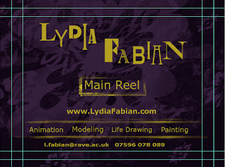
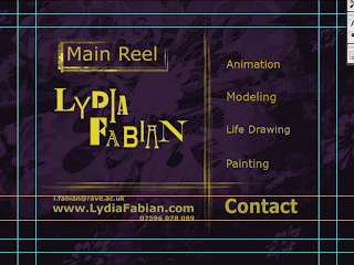
I thought to try a few layouts and these are the top two, i think i'm more into the first one because the layout is clearer and what the focus is drawn to my name then the main reel, and then the separate menus.
This is the menu i will be using for my dvd menu.
previously i had used this layout which was just a mess, the background was on a slow dust and scratches preset. I think my revised menu is better planned out.
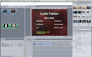
Here was a quick ident a ran together. For my name i just selected separate fonts for each letter and laid them out. I chose the purple background as that is my favorite colour and i chose the yellow/mustard coloured font as they are opposites on the colour wheel.


I thought to try a few layouts and these are the top two, i think i'm more into the first one because the layout is clearer and what the focus is drawn to my name then the main reel, and then the separate menus.
This is the menu i will be using for my dvd menu.
previously i had used this layout which was just a mess, the background was on a slow dust and scratches preset. I think my revised menu is better planned out.

Thursday, 6 May 2010
Schedule Update
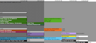
So with three weeks left there is plenty to be getting on with!
Andi is going to be modeling/texturing props, the environment and dragon, also creating the Photoshopped backgrounds.
Meanwhile I am creating a 3d animatic then moving onto the animation. Working on the the text animation like a dust effect using the font which Nghiem has sent.
Once I have a block out animatic I can send this onto one of the sound students.
Andi will also be lighting the scene.
Andi is on holiday for the last week of the deadline so I will be rendering and compositing.
Monday, 3 May 2010
Showreel research
I have been looking out for good showreels within motion graphics, character animation and animation/modeling. I can't embed showreels onto this blog as they have that disabled through youtube.
Animation mentor showcase - in their student showcase i liked how there was a variety between added music over some of the animations, and when the animation had its own audio the music would either turn off or dull down to make it obvious. They also titled each section and there was a variety of work between style and themes.
Company showreels.
Lumiere's showreel began with their company logo ident. They used music to help with the pacing and i think that it works well because they have the video clips edited in time with the music. Although personally I'm not too hot on the track used. For my showreel i need to sit and think what will work best with all my clips once i have them together.
Studio AKA - showreel, they have just linked us to a site where you can click through each animation they have done. I like that you can view all their work but it should be in a showreel labeled so that the viewer is enticed to go see more.
Trunk - They do both 3d and 2d and in their showreel they have them in separate sections titled apart. In their showreel they have cut up the longer animations and placed different parts throughout the showreel. They have used instrumental music as opposed to chart music.
It seems from these companies that the music reflects the style of their work.
Music
I feel that music is a tough call on what to place with the showreel as everyone has different tastes. It can be distracting to the content being shown or it can really drive it. I haven't thought too much about the music in my showreel, i think it should be something that isn't distracting from the work, something which isn't loud, or droning on in the background. Instrumental would work best perhaps?
What makes a successful animation showreel?
"Try and show relevant material but not a copy of their house style - originality is rewarded, so is a range of work."
"The best ones are simple"
Sourced tips from this website,
http://www.fxguide.com/modules.php?name=fxtips&rop=showcontent&id=269
What a showreel means to me is a collection and showcase of your best work. Presented in your style. Everything about it shouting out what you can do and your STYLE. So that when your dvd is put on a company shelf, they should be able to think 'oh yes' and know what you are good for. You shouldn't try and be a jack of all trades because people need to know your niche and they will come to you for what you're good at.
What am I wanting to show?
Model, Texture, Light, Rig, Animate, Life Drawing, Painting/chalks/drawing, Photography, links to online presence, CV (available to download as PDF)
Who is it for?
This is a great question because i wouldn't want to apply for an animation role and only show the employer modeling, i need to make sure i fill my reel with my best of what i can do for them. Originality will go far and quality over quantity
My DVD layout of menu will need to be easy to work. So i don't want a busy overcomplicated layout with thousands of buttons. I want it to work in both pc and dvd players, i want to to have my name and contact details plastered all over and it needs to follow a layout scheme. Colours will be what i have used for my name previously being black, pink, white and blue.
Wednesday, 28 April 2010
Email from Nghiem
Dear Lydia,
I hope you are well. I am sorry for the delay, I've got a massive deadline
for the next Ology book so my focus has been try to get that already for
print.
I hope everything is going well and you have been able continue working.
Thank you for showing me your storyboard. It looks great! I have some advice
and recommendations for you, take onboard what you like.
* Most of the time, we try to keep any new material as a continuation of the
conceit. For example, a piece of silent film captured in the late Victorian
era. Then try and be as similar as you can within the practicalities of the
project.
* Try to stick to similar looking typefaces which are already part of the
brand. If there are handwriting samples from Dr Drake then it should be in
his handwriting font.
* In Dragonology it is all about conversation, so we never encourage any
capturing of dragons. (All too serious I know but that's the story). So
please can you change the title to "How to Tame a Dragon".
The style of the 'story' suggests to me a slightly comical style to your
animation. Which is perfect! I think it all looks great. I just have one
recommendation which I recommend hoping not to cause you more work but to
give you a more rounded film...
* Please forgive me, remind me, were you thinking about basing your dragon
on a 'knucker'? If you are then, they live in damp holes near riverbanks
etc. rather than caves. They also have small wings on their backs too but
they don't fly. If you base your dragon on a small/young European, you could
keep the cave and may give you more opportunities with the note below.
* The sequence shows how to tame your dragon but once you have, what do you
do with it? What could you do with it? This is my suggestion to you.
Somewhere near your frame showing 'time passing' where day turns into night,
perhaps you could show some stills of some ideas about what you would do
with your tame dragon?
I.e. Flying on your dragon high in the sky. Or, Hand-feed your dragon a
roast chicken. Or play football with your dragon...etc. Go mad with crazy
ideas!
I look forward to seeing your film, Lydia. I'll try and get to the O2 for
Rave live. These notes would be the same comments I would send back for any
live commission but this is your project and I respect any decision you make
for your film.
I'm still chasing on that written agreement for you but you keep going. If
there was going to be a problem at this end, I would tell you by now.
Good luck.
Nghiem
-------------
Ok so analyzing the feedback from Nghiem, there are changes which will be made to the animation such as;
- The visualized style is to create the animation piece influenced by silent film captured in the late Victorian
era.
- Keep the text and font similar to the book if not the same, and if its Dr Drakes handwriting, have it being Dr Drakes handwriting.
- Change the title to "How to Tame a Dragon". "In Dragonology it is all about conversation, so we never encourage any
capturing of dragons" Nghiem said.
Andrew and I have based ours on the Knucker although the setting in a cave is wrong so, changing we're having the same animation but on a diffrernt stage. The new stage being an opening in woods where there is a broken well
Nghiem wants to see what we can do with this tamed dragon!
"Showing the dragon is tamed, Flying on your dragon high in the sky. Or, Hand-feed your dragon a roast chicken. Or play football with your dragon
do with it? What could you do with it?
For this i am going to look through the book and pick out some potential animations.
------------
Unfortunately i was unable to work this week as i was unwell, so i need to look at the work left to do and sort out a schedule which will allow Andrew and I to have this work completed in time.
Also i need to start looking at what i think are good and negative in existing showreels/dvd menus. To start planning the dvd layout when in DVD SP too. I am familiar with the software so hopefully i can up the game and make something awesome to put me ahead and stand out from the rest.
Sunday, 18 April 2010
Work update
When i re rigged the legs with the hand controller to be placed underneath the hands, i then realized that when i posed the dragons front legs into place it was not easy to set the animation from here, and the dragon (in the Musion storyboard) isn't ever in that pose.
I have now re posed the front legs on the model in the correct front facing position, where the controllers on the feet are facing forwards. I re rigged the arms again as it is always best to start from scratch rather than moving the joint placement. I also had to re set the attributes for the fingers and toes so that they curl and the fingers spread.
This certainly helps to animate the fingers using its own separate controller placed above the hand with attributes and set driven keys, as opposed to selecting each individual joint and setting key frames.
I had difficulty attaching the head controller to the spine so that i have more control over which way the head turns. Before the head just followed the movement of the neck cluster joints and would permanently be at the same angle. To achieve this i added a parent constraint to the Neck cluster controller and now i have control over the head movement.
For the jaw i haven't rigged it up because there will be blend shapes added to the face. Blendshapes allow you to create a controller set up so you can animate the face without placing lots of joints to the head, depending on what animation style you want and what provides the best movement. I am using blendshapes for creating surprised, angry, happy looks on the character.
This weekend i am just adding the final touches to the rig for the wings and feet.
I will be animating the rig in the low poly mesh and create an animatic so that the sound student can work with the file to create the sound.
Whilst i'm waiting for my high poly mesh this keeps me busy and will have me ready for painting weights on the new mesh - to make sure that the new dragon mesh bends correctly to the joints movement.
I am also waiting for the blendshapes to be created by Sanjay and the textures and displacement maps to be done by Ollie and Steph. These are my helpers for the Musion deadline, I will not be using Andi's model as it wont be ready in time.
So this past week i have been sorting out trouble with the rig, sorting and briefing a team together to help me get this work finished for the musion deadline. For the Ology project i am going to re draft another storyboard for the punchline which works really well. But i am on task for the rigging the dragon, although blendshapes will need to be added when we come to Andi's model.
Next i will put together the rig, mesh, texture and blendshapes of the dragon and animate.
Meanwhile in the Ology project Andi will have finished his model and begin modeling the environment.
Once i have the animatic for the Ology ( of the new dragon with my rig ) I will be collaborating again with the sound students to create the sound and keep working towards the final.
I feel that this last week has been a little crazy but things are going well :)
Thursday, 15 April 2010
Workflow update
I've been working on creating this dragons rig for a couple of days now and i think i've nearly got it, now i'm just tweaking here and there. This is to be completed before the end of tomorrow, so that i can attach the detailed model to the rig, paint weights, and animate! For Musion i will be drawing new storyboards which are less ambitious with the time available and produce a short animated piece which will be of a higher quality.
Rig -
Head
Setup the jaw with controller
Eyes - cartoon eyes animate the lattices and pupils OR normal eyes.
Arms/Legs
Toes
Fingers
Shoulder controllers
Tail
For the tail i will have to have two rig set ups. One for wagging and one for swooshing side to side, this is because to get one i have to disable the other.
Ears/Wings
To attach the nurbs model to the mesh i will just parent the model to the head joint.
Also to have more control of where the nurb ears go, i will need to try attaching the cylinders to a nurbs circle.
Or extrude faces from a nurbs sphere so that i don't have to continuously animate the translate axis to stay still with ear movement.
I did have trouble with parenting the head controller to allow me to have separate control over which way the head looks, as opposed to just following the spine.
I had to re rig the arms because the hand control was on the wrist and this is difficult to animate from. Also for the arms i needed to re create the joints so that it has the same principles of the leg joint and IK system. This was because i want more of a defined point from the elbow in movement. The shoulder joint needed to be un-parented from the spine because when i moved the root joint or spine the arms
Before (ctrl on wrist, arm with roll bone set up)
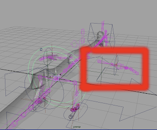
This image is showing that when i have moved the pink skeleton the arms move with it but do not bend, it does crazy things with the elbow.
After (ctrl under wrist and Leg IK setup)
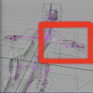
Where as in this image we can see the arm bending as it should.
Model -
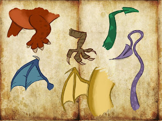
For the model to be detailed i needed to add in blocked toes and a spear end to the tail, where i will setup the toes and feet rig today. For the wings and ears even though they're being modeled in nurbs so i can get the fanned ear effect, i have blocked out the rough skeletal structure so my joint placement will match.
For the modeling i got Andi to do some more concept for the feet, tail and wings.
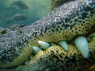
I still need to get Andi to do some concept on the teeth of the Knucker. Either to have the teeth on show like an alligators or are the teeth going to only be on show when the mouth is open. I like the idea of the teeth being on the outside but not as many as the alligator has.
Alligator reference to teeth.
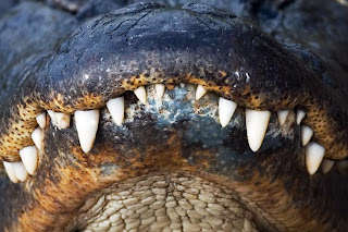
Once the head is modeled i will be adding either some blendshapes or joint controls to get some animation going there. Also when this dragon is breathing i want the body to look like its inhaled air, i need to figure out how to best do this, maybe a square stretch deformer.
One last thing would be about my storyboard for Musion, after having a talk with my tutor we thought it best to shorten the animation. Either to have a loop of the dragon asleep, wakes up and chases tail, then goes back to sleep - entertaining as people will be looking to see if they can spot where the loop is.
Or maybe incorporate the rave live logo and have it bouncing on stage with the dragon chasing and trying to catch this text!
Rough ideas which i need to develop further in such a short time.
So for the rest of today i will be ;
- Rigging the toes, wings, ears, and fingers.
- I will pass the updated model to be modeled in more detail by the end of tomorrow.
- Then with the model and completed rig i will bind the mesh to the rig.
- Then i will paint the weights to the rig (painting weights is where i assign which vertices of the mesh to be influenced by which joint, so if i move the arm i dont want the mesh on teh tail to be effected)
- After weight painting i will then be testing the animation on the rig so it's all clean
- Then once thats all tidy i can get on with animation
Meanwhile whilst i am doing that, the model will be Uv mapped and textured by my helping team, so before i need to start rendering and compositing we can assign the updated texture.
ON WE GOO!!!
Rig -
Head
Setup the jaw with controller
Eyes - cartoon eyes animate the lattices and pupils OR normal eyes.
Arms/Legs
Toes
Fingers
Shoulder controllers
Tail
For the tail i will have to have two rig set ups. One for wagging and one for swooshing side to side, this is because to get one i have to disable the other.
Ears/Wings
To attach the nurbs model to the mesh i will just parent the model to the head joint.
Also to have more control of where the nurb ears go, i will need to try attaching the cylinders to a nurbs circle.
Or extrude faces from a nurbs sphere so that i don't have to continuously animate the translate axis to stay still with ear movement.
I did have trouble with parenting the head controller to allow me to have separate control over which way the head looks, as opposed to just following the spine.
I had to re rig the arms because the hand control was on the wrist and this is difficult to animate from. Also for the arms i needed to re create the joints so that it has the same principles of the leg joint and IK system. This was because i want more of a defined point from the elbow in movement. The shoulder joint needed to be un-parented from the spine because when i moved the root joint or spine the arms
Before (ctrl on wrist, arm with roll bone set up)

This image is showing that when i have moved the pink skeleton the arms move with it but do not bend, it does crazy things with the elbow.
After (ctrl under wrist and Leg IK setup)

Where as in this image we can see the arm bending as it should.
Model -
For the model to be detailed i needed to add in blocked toes and a spear end to the tail, where i will setup the toes and feet rig today. For the wings and ears even though they're being modeled in nurbs so i can get the fanned ear effect, i have blocked out the rough skeletal structure so my joint placement will match.
For the modeling i got Andi to do some more concept for the feet, tail and wings.

I still need to get Andi to do some concept on the teeth of the Knucker. Either to have the teeth on show like an alligators or are the teeth going to only be on show when the mouth is open. I like the idea of the teeth being on the outside but not as many as the alligator has.
Alligator reference to teeth.


Once the head is modeled i will be adding either some blendshapes or joint controls to get some animation going there. Also when this dragon is breathing i want the body to look like its inhaled air, i need to figure out how to best do this, maybe a square stretch deformer.
One last thing would be about my storyboard for Musion, after having a talk with my tutor we thought it best to shorten the animation. Either to have a loop of the dragon asleep, wakes up and chases tail, then goes back to sleep - entertaining as people will be looking to see if they can spot where the loop is.
Or maybe incorporate the rave live logo and have it bouncing on stage with the dragon chasing and trying to catch this text!
Rough ideas which i need to develop further in such a short time.
So for the rest of today i will be ;
- Rigging the toes, wings, ears, and fingers.
- I will pass the updated model to be modeled in more detail by the end of tomorrow.
- Then with the model and completed rig i will bind the mesh to the rig.
- Then i will paint the weights to the rig (painting weights is where i assign which vertices of the mesh to be influenced by which joint, so if i move the arm i dont want the mesh on teh tail to be effected)
- After weight painting i will then be testing the animation on the rig so it's all clean
- Then once thats all tidy i can get on with animation
Meanwhile whilst i am doing that, the model will be Uv mapped and textured by my helping team, so before i need to start rendering and compositing we can assign the updated texture.
ON WE GOO!!!
Tuesday, 13 April 2010
Schedule Update
Week three has gone by, and this is the updated schedule for what's going on.

Although, for the Rave Live content deadline i am going to need help with the model, uv, texturing, and possibly rigging, so that i can animate this piece on time for the deadline. I will most likely re draft the storyboard.
So i have asked some other students to just help me pull it together for the deadline.
As this is going on Andi will also be modeling for our final animation due on the 21st May, which mean's i would have completed this rig and become comfortable with using in, thus improving the quality of animation in the final.
Friday, 9 April 2010
Dragon Model
After seeing Andi's model, i asked him to work on the models legs as his wasn't in the correct pose for rigging, this was because he misunderstood that the Knucker was to walk and not crawl on its belly. The model was also out of proportion in the quantity of vertices between the body and legs, meaning there were more on the body, and not so many on the extruded leg. He did say that this was a block model and the verts were no issue as i set up the rig, though i'd need them for animating.
So in the evening i re-modeled the legs into a position to rig them and the body. I had given Andi the model i'd blocked out so he could work from the same proportions and my rig would match up with the model.


I decided to model the arms in a T pose so that i could rig it as an arm, and the back legs on the ground so i could rig them as legs. I had also shortened the tail, as in my opinion it was too long, although having a longer tail keeps to the illustrations but i am concerned about the animating.
Next step is to get creating the rig, and update the model as we go along.
So in the evening i re-modeled the legs into a position to rig them and the body. I had given Andi the model i'd blocked out so he could work from the same proportions and my rig would match up with the model.


I decided to model the arms in a T pose so that i could rig it as an arm, and the back legs on the ground so i could rig them as legs. I had also shortened the tail, as in my opinion it was too long, although having a longer tail keeps to the illustrations but i am concerned about the animating.
Next step is to get creating the rig, and update the model as we go along.
Thursday, 8 April 2010
Head Experiments
I asked Andi to show me where he had gotten up to in his modeling, and he has got the outline shape of the character.

He said he was having trouble with the head design

So as i wanted to get ready for some facial rig tests i had already started creating my own head shape.


I think it helped Andi to see the shape, though on his head i would like it to be more broad and smoother on the nose curve to the eye brows.

He said he was having trouble with the head design

So as i wanted to get ready for some facial rig tests i had already started creating my own head shape.


I think it helped Andi to see the shape, though on his head i would like it to be more broad and smoother on the nose curve to the eye brows.
Musion Storyboard 1
Here is a more together storyboard for the act on stage at Rave Live.

Although i am thinking this is a bit too ambitious for the amount of time i will have to animate as well as to start and finish the rigging, with tests, and checks at Musion.
I will think of a simple way to condense this piece so i get the dragon to do a few tricks, i think also this dragon should have a name maybe.
Wednesday, 7 April 2010
Storboard - Musion, Rave Live
So i thought the best way to get started is to just put pencil to paper! I find that just sitting at a computer isn't very inspiring.
Things i'd like to get this dragon to do;
Beg
Twirl
Speak
Play dead
Roll over
Chase its own tail
Scratch its head with the wing
Mesmerized by own tail
Sneeze
Fetch
Attempt to fly.
Storyboards

So firstly i was thinking how to introduce my character on stage, is he already going to be on stage ? In this design i have the dragon sleeping and he wakes himself up in two ways. One being he sneezes and covers himself in smoke, or the second being he sneezes in his sleep and wakes up confused covered in smoke. The way dogs wake up is quite funny because they sometimes look as though they forget where they are, looking confused.

Here we have two options to how he could fly.. with his wings being so small he could be walking on his hind legs whilst flying to life the front half of the body. He chases his tail, mesmerized by his own tail, and rolls onto his back. Just some tricks to use in the show.

What if he came on stage in a box, and sneezes and blows open to box?
The bottom half is the beginning of a storyboard where we call the dragon onto the stage. I could really act this out to get the audience involved, like a panto. Basically we call the dragon onto stage as he's a little nervous. The dragon looks around the audience, and decides to come out onto the stage. I flash a gem, a dragons favorite lunch!

I wave this gem around and the dragon doesn't take his eyes off this gem. I throw this gem off stage, emptying the stage from the dragon - maybe i start to talk some facts about the Knucker. We can hear the Knucker off screen munching the gem and coming back onto stage for another one. The dragon sits patiently whilst i talk.

Whilst still talking about the dragon it gets distracted by its own tail, then begins to chase its own tail. This is until i tell him to play dead - overly dramatic. Then it's the end of the performance and i get the dragon to bow and leave.
----------
There's just me throwing out some ideas. I would like to involve him trying to fly because every time i ask what people want to see this dragon do is either fire or watch it attempt to fly.
I'll have a think and a shuffle to see what else comes out. I thought that in this storyboard, the dragon would naturally have a short attention span.
Things i'd like to get this dragon to do;
Beg
Twirl
Speak
Play dead
Roll over
Chase its own tail
Scratch its head with the wing
Mesmerized by own tail
Sneeze
Fetch
Attempt to fly.
Storyboards

So firstly i was thinking how to introduce my character on stage, is he already going to be on stage ? In this design i have the dragon sleeping and he wakes himself up in two ways. One being he sneezes and covers himself in smoke, or the second being he sneezes in his sleep and wakes up confused covered in smoke. The way dogs wake up is quite funny because they sometimes look as though they forget where they are, looking confused.

Here we have two options to how he could fly.. with his wings being so small he could be walking on his hind legs whilst flying to life the front half of the body. He chases his tail, mesmerized by his own tail, and rolls onto his back. Just some tricks to use in the show.

What if he came on stage in a box, and sneezes and blows open to box?
The bottom half is the beginning of a storyboard where we call the dragon onto the stage. I could really act this out to get the audience involved, like a panto. Basically we call the dragon onto stage as he's a little nervous. The dragon looks around the audience, and decides to come out onto the stage. I flash a gem, a dragons favorite lunch!

I wave this gem around and the dragon doesn't take his eyes off this gem. I throw this gem off stage, emptying the stage from the dragon - maybe i start to talk some facts about the Knucker. We can hear the Knucker off screen munching the gem and coming back onto stage for another one. The dragon sits patiently whilst i talk.

Whilst still talking about the dragon it gets distracted by its own tail, then begins to chase its own tail. This is until i tell him to play dead - overly dramatic. Then it's the end of the performance and i get the dragon to bow and leave.
----------
There's just me throwing out some ideas. I would like to involve him trying to fly because every time i ask what people want to see this dragon do is either fire or watch it attempt to fly.
I'll have a think and a shuffle to see what else comes out. I thought that in this storyboard, the dragon would naturally have a short attention span.
Musion Academy
"Musion Eyeliner System is a new and unique high definition video 3D projection system allowing spectacular freeform 3-dimensional holographic moving images to appear within a live stage setting." Musion
Musion Explained
What i am wanting to do for Rave Live is to use this Knucker dragon and with help from Musion i will be able to project the animation onto the 3d stage. When i went to the Musion meeting last week it fueled my ideas for what i could do with the dragon, you can interact with the animation on stage - which sounds great and more personal than just watching something one stage.
Musion Showreel
Oliver Gingrich is the Rave Live point of contact so i am going to be working with him to run tests with the rig on the 3d stage. Oliver said he had something similar for me to reference to which involved a 3d dragon on stage. Meanwhile i will create some storyboards for what this dragon could do on stage.
----------
Musion Explained
What i am wanting to do for Rave Live is to use this Knucker dragon and with help from Musion i will be able to project the animation onto the 3d stage. When i went to the Musion meeting last week it fueled my ideas for what i could do with the dragon, you can interact with the animation on stage - which sounds great and more personal than just watching something one stage.
Musion Showreel
Oliver Gingrich is the Rave Live point of contact so i am going to be working with him to run tests with the rig on the 3d stage. Oliver said he had something similar for me to reference to which involved a 3d dragon on stage. Meanwhile i will create some storyboards for what this dragon could do on stage.
-----Original Message-----
From: Lydia Fabian [mailto:l.fabian@rave.ac.uk]
Sent: 06 April 2010 14:06
To: Oliver Gingrich
Subject: Ravensboure - Matter Content

Hey Oliver,

Lydia here from Ravensbourne, i appreciate that you said you were rather
busy within these next two weeks, but i was wondering if you could give
me some scope on things?

I am wanting to create and animate a dragon on stage.
I plan to have this character fully rigged and leaving me with a few
days left for animating before the Rave Live content deadline (19th April).

I'm wondering how much time i will need to set aside for getting it set up correctly with the 3d stage? I believe i can get the animating done, and
i plan to send you some storyboards/animatics to see what you think and how it will come across on stage and what works best.

Thought it wise to send this email so i can organize my thought on whats going on :)

Thanks Oliver,

Lydia Fabian
----------
Dear Lydia,
Thanks for getting in touch! I received your previous email but was in
demos back to front for most of the day, but will send you documentation
of the mini dragon asap.

I am happy to run through the storyboard with you and will happily
advise you during your process at all stages. Do you want to send me a
complete breakdown of a rough production plan and I might be able to
give you feedback on it? However you plan to do this, I would budget for
a bit of testing time. I am happy to squeeze you in between demos here
so that you can get as much feedback as possible on your animation.
Thanks and speak soon,
Oliver
Very nice rigged dragon.
After seeing this dragon and the features on the rig i contacted Jessica DeLacy, who created the rig and is currently on her fourth year Character Rigging major.
What i really would like to pull from this, is the eye brow movement, feet/toes. She's using Set Driven Keys, Clusters, blendshapes and bones for movement.
-------------
Your amazing dragon :)
Hello,i noticed your rig online and i was wondering whether you i would be able to have some of your advice?
basically i'm wanting to create a dragon rig, but the dragon i'm modeling is more lizard like a long. So what i wanted to get some tips on was how you got the mouth to move like that? and the tail? and most of all those eyebrows are amazing!
The dragon i'm modeling is meant to be more of a cartoon-like animation style.
Please could you give me some pointers?
Hope to hear from you soon,
Lydia Fabian
-----------
Re: Your amazing dragon :)
Hello,So you mean more of like a Chinese style dragon then? Cool!
The mouth and eyebrows were set up using just a bone based facial UI, and the tail was done with clusters. The best option for a tail would actually be to have an IKFK blend though.
Since it's going to be cartoony, I'd recommend adding in squash and stretch as well.
I can try to walk you through this if you don't know how to set it up, since I'm not sure how familiar you are with rigging!
Let me know how I can help. My e-mail is aeyoqen@gmail.com :]
-----------
Re: Your amazing dragon :)
Kind of, the dragon i'm rigging is a Knucker. You can see it if you type it into google, its a red one, i'd paste it onto this message but I'm not sure how.I'm not so hot on rigging, i know basics here and there, but I'm certainly up for trying my hardest to get this character looking my best.
IKFK blends.. are a mystery to me right now, the only rigging i have done successfully was a gorilla but only in IK, it was a uni project, i should probably mention this is a uni project i am doing, I'm on my second year of animation, and you would be mentioned in my blog if that's alright with you?
I think i can get how to do the clusters for the tail.. I haven't got the model ready yet, but just looking ahead. maybe we could run some tests for the face though? That would be awfully helpful if we could?
Thank you :)
Lydia
----------
Re: Your amazing dragon :)
Ahhh, cool. I've never heard of a Knucker until now!Rigging is definitely something that you learn by doing, but it's not something that you want to do all at once. I can probably make up a tutorial for IKFK pretty quickly and put it on my blog (it's fine if I'm on yours as long as you're fine being on mine - http://willrigforfood.blogspot.com/). You will probably want to have IKFK legs, neck, spine and tail at the very least, and go from there. Squash and stretch should be something that you tackle later if you feel up to it.
Actually, here's a good IKFK tutorial by a teacher of mine: http://www.mason3d.com/arm_tutorial.html
For the face, you have the option of doing blendshapes or bones. If you have a mock or low poly face made up, it's pretty easy to set up some basic tests on it :]!
I'm also in Uni right now, as a fourth year Character Rigging major!
-Jessica
------------
Re: Your amazing dragon :)
Awesome.. where are you in the world?Rigging is definitely what you're wanting to work in then, i like it!
Ok so i will quickly do a rough model of the face and have a try at creating the blendshapes and/or bones.
One other thing was your wings with ncloth?
I have help from my teacher so if i get overly confused i can ask him too, but basically in the Knucker design my friend has come up with, i'm thinking it would look great with ncloth on the ears.. its like three small joints.. you can see it on my blog, its the red dragon on here you see..
http://lydiafabian-ology.blogspot.com/
What's worse is that i have to rig this character before the 15th April lol
I shall put all of my heart into this though if i can make it work. The best way is trial and error.. upsetting that mostly errors though lol
Lydia
-------------
So i before Jessica has gotten back to me about n cloth, i have tried using Surfaces>Loft
Side Shot
Front Shot
I think with this though i am going to add a ball for the cylinders to be part of, so when i move them its not going to move the skin bit in the middle when i want to move the whole ear shape.
Tuesday, 6 April 2010
Andi's Knucker concept
Andi sent me these concepts he had done the other day, we had talked about what research we had found and what we think would and wouldn't work. I was talking about how i wanted movement in the eye brows, eyes, ears and mouth. With the red illustration i think I'm in love, and i would like to see more as Andi works on the character sheet. The eyebrows are strong and definitive, and it all just flows nicely on the head, a simple design rather than the more detailed and complicated ones i drew, Andi has simplified our designs wonderfully.


Andi has also tried the Knucker in other colours as we are told from the book, we are thinking to go for the red colour because this will be more obvious when the model is brought into the environment. The blue coloured Knucker looks feminine to me because the ears come off from the eye brow, also it has more of a feminine head shape because of the curves, unlike the red design where we have much stronger, straighter broad lines. For the brown dragon the face is rather square, this design doens't stick out to me as much but the top of the head shape could be used on the red design, or the point of the skull like a dogs head.


Andi has also tried the Knucker in other colours as we are told from the book, we are thinking to go for the red colour because this will be more obvious when the model is brought into the environment. The blue coloured Knucker looks feminine to me because the ears come off from the eye brow, also it has more of a feminine head shape because of the curves, unlike the red design where we have much stronger, straighter broad lines. For the brown dragon the face is rather square, this design doens't stick out to me as much but the top of the head shape could be used on the red design, or the point of the skull like a dogs head.
Email from Nghiem
Hi Nghiem,
The team consists of two people, myself and Andrew Bennett.
Just had a look at the DS game, really loved the idea of the dragon
illustrations coming to life from the book, maybe i could think of a nice
way to make the transition into 3d.
We'll do some varied storyboards for the 'spell to catch a dragon' and you
can choose which one you like or what you like of each so we could draft
another storyboard for you.
We are planning to get the storyboards finished by the end of this week so
we can begin the model next week, the schedule is on my blog;
http://lydiafabian-ology.blogspot.com/
So if i get you to have a look through the storyboards which we can send
to you within the next few days. It would be great if you can give us your
feedback ideally before the end of next week.
Thank you again,
Lydia Fabian
-----------------
Hi Lydia,
I hope you are well. Thank you for chasing me. It's all pretty manic at the
moment, so please free feel to contact and prompt me. Don't let me hold you
up.
Thanks for your emails. I did get them, had to retrieve them from a junk
file but it often happens.
Your assignment brief looks very well structured and your project brief
looks straight forward and very interesting. I look forward to seeing your
final film. I would love to see your storyboards and ideas for art
direction, only if you are happy to do so.
We are currently sorting out an agreement document for you. In the
assignment brief, it mentioned you working in a team? May I ask, are you
heading a project team of 2 or 3 people? I may have to organise additional
agreement notes for them.
In your previous email, you asked about Dragonology artwork in 3-D formats.
If you go to the Ologyworld.com site, via the green dragon on the armchair
you will find information on the Nintendo DS game. In the far right of the
library room, you will find a stone model of a dragon, this link will take
you a page where you are see a Augmented Reality 3-D dragon (there a preview
video too).
The Nintendo dragons are simpler in their visualisation due to the
resolution and capacity of the console.
The Augmented Reality dragon is the most complex 3-D dragon we've
commissioned. To see the experience, you will need a copy of the Compendium
book and download the plug-in.
I hope things are going well. Let me know if I can be of further help.
Regards,
Nghiem
------------
On 31/3/10 10:32, "Lydia Fabian" wrote:
Good morning Nghiem,
I am just emailing you to check that you had received my email last Wednesday 24th March, containing the breakdown of the brief and content we intend to use in creating the animation?
Thank you,
Lydia Fabian
The team consists of two people, myself and Andrew Bennett.
Just had a look at the DS game, really loved the idea of the dragon
illustrations coming to life from the book, maybe i could think of a nice
way to make the transition into 3d.
We'll do some varied storyboards for the 'spell to catch a dragon' and you
can choose which one you like or what you like of each so we could draft
another storyboard for you.
We are planning to get the storyboards finished by the end of this week so
we can begin the model next week, the schedule is on my blog;
http://lydiafabian-ology.blogspot.com/
So if i get you to have a look through the storyboards which we can send
to you within the next few days. It would be great if you can give us your
feedback ideally before the end of next week.
Thank you again,
Lydia Fabian
-----------------
Hi Lydia,
I hope you are well. Thank you for chasing me. It's all pretty manic at the
moment, so please free feel to contact and prompt me. Don't let me hold you
up.
Thanks for your emails. I did get them, had to retrieve them from a junk
file but it often happens.
Your assignment brief looks very well structured and your project brief
looks straight forward and very interesting. I look forward to seeing your
final film. I would love to see your storyboards and ideas for art
direction, only if you are happy to do so.
We are currently sorting out an agreement document for you. In the
assignment brief, it mentioned you working in a team? May I ask, are you
heading a project team of 2 or 3 people? I may have to organise additional
agreement notes for them.
In your previous email, you asked about Dragonology artwork in 3-D formats.
If you go to the Ologyworld.com site, via the green dragon on the armchair
you will find information on the Nintendo DS game. In the far right of the
library room, you will find a stone model of a dragon, this link will take
you a page where you are see a Augmented Reality 3-D dragon (there a preview
video too).
The Nintendo dragons are simpler in their visualisation due to the
resolution and capacity of the console.
The Augmented Reality dragon is the most complex 3-D dragon we've
commissioned. To see the experience, you will need a copy of the Compendium
book and download the plug-in.
I hope things are going well. Let me know if I can be of further help.
Regards,
Nghiem
------------
On 31/3/10 10:32, "Lydia Fabian"
Good morning Nghiem,
I am just emailing you to check that you had received my email last Wednesday 24th March, containing the breakdown of the brief and content we intend to use in creating the animation?
Thank you,
Lydia Fabian
Schedule Update
From last week Andi and I have both completed the character concept. The storyboard will need to be produced into an animatic which I had failed to place into the schedule. To fit the Musion deadline for the Rave Live content I have altered the schedule so that Andi and I concentrate on getting this dragon fully rigged and ready to animate by say the 15th April, which will give me enough time carefully storyboard the performance and then I'm left to animate.
To do this I have shifted the modeling of the environment one week back so that the dragon will be completed in one section all together. I have added in a Musion section for me to complete. Whilst I am doing this Andi will be modeling the background and sorting out the loose ends.

Also for Rave Live i have scheduled in what i need to do for Musion, being to storyboard a script for the 3d hologram stage, produce animatic and to animate the character, with some sound added to bring the character to life.
Once the Rave Live deadline is out of the way Andi and I will be left with a completed dragon and environment. We will be left with modeling the props, animating, lighting, sound, compositing and rendering.
When compositing and rendering out i will have time to sort out my showreel for hand in.
To do this I have shifted the modeling of the environment one week back so that the dragon will be completed in one section all together. I have added in a Musion section for me to complete. Whilst I am doing this Andi will be modeling the background and sorting out the loose ends.

Also for Rave Live i have scheduled in what i need to do for Musion, being to storyboard a script for the 3d hologram stage, produce animatic and to animate the character, with some sound added to bring the character to life.
Once the Rave Live deadline is out of the way Andi and I will be left with a completed dragon and environment. We will be left with modeling the props, animating, lighting, sound, compositing and rendering.
When compositing and rendering out i will have time to sort out my showreel for hand in.
Sunday, 4 April 2010
Plan
Ok, so the updated plan is for Andi to model this dragon this week as scheduled, and once the basic dragon model is there i will be able to begin rigging and set the joint placements.

This diagram above is a rough plan for the joint placements, i am thinking to use an IK Spline handle
Dynamically drive a joint chain with Hair in Maya
This tutorial just covers how i can stretch the joints and geometry - which can be used on tails or tentacles.
This second video looks like i could perhaps try this for allowing me to exaggerate the animation when looking at the sapphire.
Stretchy Spine IK
This looks awesome in that i can get the movement and twists of the neck of the dragon, but i'd need to figure out how he did this because it's not a tutorial. But i'm sure if i ask around and have a dig through google i can source how it was created.
Spline Ik Rig Setup pt2
The man in this tutorial has added control handles and the constraints to the clusters allow great control over the movement of the joints separately.
These are just some references i have looked at to understand the type of movement i can get from Spline IK Handles.
Saturday, 3 April 2010
The Last Dragon - Documentary
I remembered this documentary i bought ages ago and this will be such a great help in understanding the shape again. Also the existing animation within the series is another great reference for this type of dragon in the documentary.


These two screenshots where the dragon jumping to another rock.
I think the second shot is awesome to show the body outline for our Knucker's shape.


In these head pictures, i loved the shape and position of the facial features as it is closer to the Dragonology illustrations. Although the Knucker has bigger eyes in the illustrations, for the baby Knucker the eyes are placed on the top of the head, where as for the adult Knucker the eyes are on the side of the head.
Adult Knucker

Baby Knucker

The nostrils are at the front on both illustrations though, and the spikes for behind the head seen in the screenshot above are similar to the ears of the baby Knucker. Whereas the adult Knucker has less detail for the ears.
Head - Mesh


Awesome modeled mesh for the skull of the dragon.


These last three shots from the documentary were to show a fossilized dragon.
Underwater - Dragon swimming

Very powerful looking leg, i believe the Knucker would need powerful legs to carry the weight of its body.


Wings as positioned not too far behind the front leg shoulder, and the front leg is one third of the way down on the body from the spine.

I liked the look of the jaw, and again how everything is positioned on the face.


So from watching the last dragon i feel this will help me alot with the movement, although there wasn't much of a 'full body shot' as they used mostly close ups during the documentary.
What i will gain the most from this is looking at the head shape, and comparing between the different illustrations of the Knucker i will need to talk to Andi for deciding what the best way to model him will be.


These two screenshots where the dragon jumping to another rock.
I think the second shot is awesome to show the body outline for our Knucker's shape.


In these head pictures, i loved the shape and position of the facial features as it is closer to the Dragonology illustrations. Although the Knucker has bigger eyes in the illustrations, for the baby Knucker the eyes are placed on the top of the head, where as for the adult Knucker the eyes are on the side of the head.
Adult Knucker

Baby Knucker

The nostrils are at the front on both illustrations though, and the spikes for behind the head seen in the screenshot above are similar to the ears of the baby Knucker. Whereas the adult Knucker has less detail for the ears.
Head - Mesh


Awesome modeled mesh for the skull of the dragon.


These last three shots from the documentary were to show a fossilized dragon.
Underwater - Dragon swimming

Very powerful looking leg, i believe the Knucker would need powerful legs to carry the weight of its body.


Wings as positioned not too far behind the front leg shoulder, and the front leg is one third of the way down on the body from the spine.

I liked the look of the jaw, and again how everything is positioned on the face.


So from watching the last dragon i feel this will help me alot with the movement, although there wasn't much of a 'full body shot' as they used mostly close ups during the documentary.
What i will gain the most from this is looking at the head shape, and comparing between the different illustrations of the Knucker i will need to talk to Andi for deciding what the best way to model him will be.
Subscribe to:
Comments (Atom)

