Saturday, 22 May 2010

Monday, 17 May 2010
Title, light tests
This first clip is much too fast, the lighting is really rough and choppy..
I then wanted the 'HOW TO TAME A DRAGON' to be on screen longer as this is the introduction to the animation.
Here i have sorted out the lighting and i have begun to add a fractal noise effect so that when the text appears it will shimmer and dull so it is not missed, and then will fade like the title.
I have asked a few friends about how the timing reads on the last sequence and they all thought it worked well. Obviously this is unfinished but its just the timing needed for now.
Schedule Update
Ok so this is the FINAL week as deadline is on Friday 21st May 5pm.
Andi has now left for Cuba and I have lots to be getting on with as we are behind schedule.
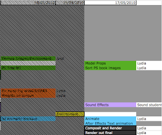
Ok so list of order for things to work -
I need to have the timing correct in the animation to send for the sound student to work on, which means the dragon animation needs to be finished completely.
For the text animation i just need the timing to be right when things pop up and make sure everything is on there like a sparkle when the diamonds come on.
I can then hand this to the sound student to work on whilst i meanwhile work on the title sequence in the looks, and not altering the timing.
1. Complete dragon animation.
2. Text animation completed.
3. Sound student!
I now also have to model the props for the scene and draw the prop illustrations i wanted for the title sequence.
I am not happy with the look of the title sequence but this is low in my priorities right now though its on my mind. I need to give it that old look i was talking about with using PS to get the textures and colours i want.
4. Illustrations of props and first shot of scene.
5. Photoshop work on title sequence book.
So far that's what i will be concentrating on for the next day or two. I have already animated out two of the shots so i have two left to do then i can send them to the sound student.
I'll post up the two renders for the shot sequence on here once i have rendered them out
Andi has now left for Cuba and I have lots to be getting on with as we are behind schedule.

Ok so list of order for things to work -
I need to have the timing correct in the animation to send for the sound student to work on, which means the dragon animation needs to be finished completely.
For the text animation i just need the timing to be right when things pop up and make sure everything is on there like a sparkle when the diamonds come on.
I can then hand this to the sound student to work on whilst i meanwhile work on the title sequence in the looks, and not altering the timing.
1. Complete dragon animation.
2. Text animation completed.
3. Sound student!
I now also have to model the props for the scene and draw the prop illustrations i wanted for the title sequence.
I am not happy with the look of the title sequence but this is low in my priorities right now though its on my mind. I need to give it that old look i was talking about with using PS to get the textures and colours i want.
4. Illustrations of props and first shot of scene.
5. Photoshop work on title sequence book.
So far that's what i will be concentrating on for the next day or two. I have already animated out two of the shots so i have two left to do then i can send them to the sound student.
I'll post up the two renders for the shot sequence on here once i have rendered them out
Sunday, 16 May 2010
TExt
I am trying to figure out how to achieve the look which i want for the text, i want it to FEEL as though we are looking into an old tethered and magical book, discovering secrets about these dragons!
I want the look of a candle flame flickering and lighting up the scene as we read the text.
Here is a quick render test in after effects using expressions on the light layer and it only effects the dragonoloy logo, not the text. I'm having trouble in not understanding why the light wont show up the text in the composition. Anyway this fluctuation of the light gives me the impression of a fast flickering flame which isn't the soft feel i wanted for the dragon.
(quick thought here, what if i were to darken out the scene when hearing the dragon roar to take us into the 3d environment)
Here is another render out of the same footage but i have slowed the fluctuation down which looks better in my opinion. I want a slower flicker because i imagine this book to be read in a quiet secret place, not outside in the blazing wind THIS BOOK IT FRAGILE!
I am thinking of kerning the text for the title to make it look more aged and withered, also on the dragonology logo. Though first i need to have my timing sorted so i can hand it to the sound student then i can continue working on it.
I want the look of a candle flame flickering and lighting up the scene as we read the text.
Here is a quick render test in after effects using expressions on the light layer and it only effects the dragonoloy logo, not the text. I'm having trouble in not understanding why the light wont show up the text in the composition. Anyway this fluctuation of the light gives me the impression of a fast flickering flame which isn't the soft feel i wanted for the dragon.
(quick thought here, what if i were to darken out the scene when hearing the dragon roar to take us into the 3d environment)
Here is another render out of the same footage but i have slowed the fluctuation down which looks better in my opinion. I want a slower flicker because i imagine this book to be read in a quiet secret place, not outside in the blazing wind THIS BOOK IT FRAGILE!
I am thinking of kerning the text for the title to make it look more aged and withered, also on the dragonology logo. Though first i need to have my timing sorted so i can hand it to the sound student then i can continue working on it.
Friday, 14 May 2010
Research for title animation
This is just a quick test render of the dragon finding the gem.
http://www.youtube.com/watch?v=WRUgNRfgjn4&feature=related
This link has the idea for adding a mask with feather, and pretty much animating up and down the page to find the text. It's more creative than just changing the opacity.
I was also thinking what if i were to unmask the text so it looks mystical. Influenced by harry potter title sequence.
For the paper background which i have at the moment, i feel that the text, motif border and paper don't all fit together, it's looking too digital.

So here are some paper ideas which will inspire the new look

I like the darkness on either side of the image

I am liking the grain

I like the grain here but i feel the contrast is too high.

How about using the idea of it being in the page spread of the spine.

And finally the little motifs in the corners, i like the idea of using the dragonology logo in the background.
Wednesday, 12 May 2010
Text Test 2
By adding a Tritone effect i can control the mid tones highlights and shadows, so it has given me the golden look i wanted. Now to play with a glow or light.
Text Test
I applied fractal noise to the images in After Effects for a quick test render to how this would look. I would like to be able to control the colour to a gold which i'll play with later. Alsofor a way to keep the text on the page after in the beige i will use a separate layer of the same text underneath. Maybe i could add a Glow or use the Light Ray effect to make it go out with a shine.
I like how this is looking though maybe make one sweep with the shimmer.
Subscribe to:
Posts (Atom)